Feedback Rocket - Integration GuidesUsing Feedback Rocket with Docusaurus
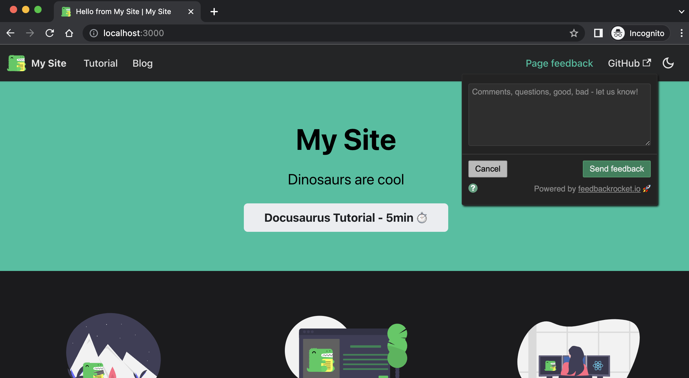
Integrating Feedback Rocket with Docusaurus only takes a couple of minutes. In this example we’ll walk through adding a feedback link into the top nav of an out-of-the-box Docusaurus site, allowing visitors to leave feedback on any page they happen to be looking at.
Assuming you’ve already got a Feedback Rocket account, the only prep you’ll need is to make sure you’ve got your 21-character long identifier copied from your widget setup page. Armed with that, all we need to do is make a couple of changes to docusaurus.config.js, the first of which is to load the Feedback Rocket SDK. Open up docusaurus.config.js and add scripts element to the top-level config object:
/** @type {import('@docusaurus/types').Config} */
const config = {
  title: 'My Site',
  tagline: 'Dinosaurs are cool',
  favicon: 'img/favicon.ico',
  url: 'https://your-docusaurus-test-site.com',
  baseUrl: '/',
  organizationName: 'your-org', // Usually your GitHub org/user name.
  projectName: 'your-repo', // Usually your repo name.
  onBrokenLinks: 'throw',
  onBrokenMarkdownLinks: 'warn',

  // Load the Feedback Rocket SDK on every page
  scripts: [
    {
      async: true,
      src: 'https://www.feedbackrocket.io/sdk/v1.2.js',
      'data-fr-id': '<your-21-character-id>',
    }
  ],

  i18n: {
    defaultLocale: 'en',
    locales: ['en'],
  },
  ...
It’s important that you replace the value of the data-fr-id property with your own identifier, and make sure you replace the angled brackets when doing so. Whether or not you load the script with async, defer or neither is up to you.
Theming
Feedback Rocket supports ‘dynamic’ theming, where the widget will attempt to pick the light or dark theme based on the user’s system preference or the colour scheme indicated by your website. This is particularly handy for a box-fresh Docusaurus installation which lets visitors toggle between light and dark modes. To opt-in to dynamic theming in your widget, simply add a data-fr-theme property to your script config and set it to dynamic:
/** @type {import('@docusaurus/types').Config} */
const config = {
  ...

  scripts: [
    {
      async: true,
      src: 'https://www.feedbackrocket.io/sdk/v1.2.js',
      'data-fr-id': '<your-21-character-id>',
      'data-fr-theme': 'dynamic',
    }
  ],

  ...
Next—and last!—we just need to a feedback button to our top nav. We’re going to add it top right just before the GitHub link, but any position and alignment will work. The important attribute below is data-fr-widget—it’s this which ensures the Feedback Rocket widget shows when the link is clicked:
themeConfig:
  /** @type {import('@docusaurus/preset-classic').ThemeConfig} */
  ({
    image: 'img/docusaurus-social-card.jpg',
    navbar: {
      title: 'My Site',
      logo: {
        alt: 'My Site Logo',
        src: 'img/logo.svg',
      },
      items: [
      {
        type: 'doc',
        docId: 'intro',
        position: 'left',
        label: 'Tutorial',
      },
      { to: '/blog', label: 'Blog', position: 'left' },

      // Add a feedback button in the top navbar on every page
      {
        type: 'html',
        position: 'right',
        value:
          `<a href=# class=navbar__link data-fr-widget>
            Page feedback
          </a>`
      },

      {
        href: 'https://github.com/your-org/your-repo',
        label: 'GitHub',
        position: 'right',
      },
      ],
    },
    footer: ...
And that, believe it or not, is that—we’re done. Happy feedbacking! 🚀
Optional extra configuration
Feedback Rocket supports a few other optional extras, all of which can be configured for use with Docusaurus. Head to your widget setup page to see which data-fr-xxx attributes and values are available, and simply copy them into your docusaurus.config.js file as keys and values in the scripts object as we have done elsewhere in this tutorial. If you get stuck at all, please don’t hesitate to get in touch!